"Mobile-first" has been advice for so long that it stopped meaning anything. Everyone nods. Everyone designs on a 27-inch monitor anyway, then squints at a narrow browser window at the end and calls it responsive.
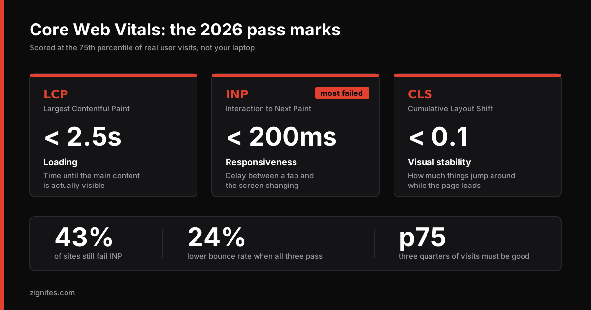
In 2026 there is a scoreboard that does not care what you called it. Google measures the real experience of real users on real devices, and 43% of sites still fail the INP threshold. That makes responsiveness the most commonly failed Core Web Vital, and it is failed almost entirely on mobile.
This post is about closing the gap between what you see in DevTools and what your users actually get.
The three numbers, and which one is quietly hurting you
Metric | What it measures | Good | Reality |
|---|---|---|---|
LCP | Time until the main content is visible | Under 2.5s | Usually an image or a font problem |
INP | Delay between tap and visible response | Under 200ms | The one most sites fail |
CLS | How much the layout jumps around | Under 0.1 | Usually ads, images without dimensions, or late fonts |
Two things about how this is scored that people get wrong constantly:
It is the 75th percentile, not the average. Seventy-five percent of your visits must be good for the page to pass. Your median user being fine is irrelevant if a quarter of your traffic is on a three-year-old Android in a rural area. Averages hide exactly the users you are failing.
It is field data, not lab data. Lighthouse runs a simulation on your machine. Core Web Vitals in Search Console come from the Chrome User Experience Report, which is actual humans on actual devices. A 98 in Lighthouse and a failing grade in Search Console is not a contradiction. It means your simulated conditions are more generous than reality.
If you are only looking at Lighthouse, you are grading your own homework on a machine that costs more than most of your users' phones.
INP is a JavaScript problem wearing a design costume
INP measures the gap between a user tapping something and the screen visibly changing. When it is slow, it is almost always because the browser's main thread is busy doing something else and cannot get to your click handler.
The four usual culprits:
1. Too much JavaScript on the main thread
A mid-range Android device parses and executes JavaScript roughly four to six times slower than a modern laptop. Every kilobyte you ship is a tax paid by your slowest users.
The fix is architectural, not a tweak: move work to the server, and ship less to the browser. This is exactly the industry shift we covered in what actually changed in web development in 2026. Server-rendered content requires no client JavaScript to become interactive, so there is nothing blocking the main thread when the user taps.
2. Long tasks that block everything
Any task over 50ms blocks input handling. Sorting a large array, parsing a big JSON payload, running an expensive filter on every keystroke.
// Blocks the main thread for the full duration
function processAll(items) {
  return items.map(expensiveTransform)
}

// Yields to the browser between chunks so taps still register
async function processAll(items) {
  const out = []
  for (let i = 0; i < items.length; i++) {
    out.push(expensiveTransform(items[i]))
    if (i % 50 === 0) await scheduler.yield()
  }
  return out
}
scheduler.yield() is well supported in 2026 and is the cleanest way to break up long work. If you need broader support, await new Promise(r => setTimeout(r, 0)) does the same job less elegantly.
3. Third-party scripts you forgot about
Chat widgets, analytics, heatmaps, A/B testing tools, that one pixel marketing added in 2023 for a campaign that ended.
Run this and be honest about the results:
performance.getEntriesByType('resource')
  .filter(r => !r.name.includes(location.hostname))
  .sort((a, b) => b.duration - a.duration)
  .slice(0, 10)
  .forEach(r => console.log(Math.round(r.duration) + 'ms', r.name))
We have run this on client sites and found 400 KB of tag manager payload for tools nobody had opened in a year. Deleting things is the fastest performance optimization available and nobody puts it on a slide.
4. Rendering work triggered by the interaction itself
If tapping a filter re-renders four hundred list items, the tap is cheap and the render is not. Virtualize long lists, memoize aggressively, and where possible give immediate visual feedback before doing the heavy work.
LCP is almost always an image or a font
If your LCP is bad, walk this list in order. It is nearly always one of these four.
Your hero image is too big. Serve WebP or AVIF, size it to actual display dimensions, and set an explicit sizes attribute. A frequent and expensive mistake is a responsive image component requesting a 3840px-wide asset for an element that renders at 400px on a phone. Check yours. This bug is more common than it has any right to be.
Your hero image is lazy-loaded. Never lazy-load the LCP element. Lazy loading is for below the fold. Applying it to the hero guarantees a slow LCP.
You are not preloading it. One line:
<link rel="preload" as="image" href="/images/hero.webp"
      imagesrcset="/images/hero-800.webp 800w, /images/hero-1600.webp 1600w"
      imagesizes="100vw" fetchpriority="high">
Your fonts block rendering. Self-host, preload the woff2, and always set font-display: swap. A web font fetched from a third-party domain requires a DNS lookup, a TLS handshake, and a download before any text appears.
CLS is the easiest to fix and the most annoying to experience
Layout shift is what makes someone tap the wrong thing because a banner loaded above the button. Three rules cover almost all of it:
Every image and video gets explicit
widthandheight. The browser reserves the space before the file arrives.Reserve space for anything that loads late. Ads, embeds, cookie banners, dynamically injected notices. Give them a
min-heightcontainer.Match your fallback font metrics. Use
size-adjustandascent-overridein your@font-faceso the swap from fallback to web font does not reflow the page.
Mobile-first as a design practice, not just a metric
Performance is half of it. The other half is that phones are a genuinely different interaction model, and designing on a desktop hides that.
Thumb reach is real. Most one-handed phone use puts the bottom third of the screen in comfortable reach and the top corners nearly out of it. Primary actions belong low. Destructive actions belong away from where the thumb naturally rests.
Touch targets need 44 by 44 pixels minimum. Not because a guideline says so, but because fingers are imprecise and a mis-tap on a mobile checkout is a lost sale.
Forms are where mobile conversions die. Set the right inputmode and autocomplete attributes so the correct keyboard appears and autofill works. This is five minutes of work and it measurably moves completion rates.
<input type="email" inputmode="email" autocomplete="email">
<input type="tel" inputmode="tel" autocomplete="tel">
<input inputmode="numeric" autocomplete="one-time-code" pattern="[0-9]*">
Test in sunlight. Genuinely. Low-contrast grey-on-grey text that looks refined in a dark office is invisible outdoors, which is where a lot of mobile browsing happens.
Does any of this actually move the business number?
Sites passing all three Core Web Vitals thresholds see roughly 24% lower bounce rates and measurably better organic rankings. Content relevance still outweighs speed as a ranking factor, but speed is the tiebreaker between two pages that are otherwise comparable. In a competitive niche, that tiebreaker is the whole game.
There is also the simpler argument. Fast sites feel trustworthy. Slow ones feel neglected, and people extend that judgement to the business behind them.
Your Core Web Vitals assessment failed. Now what?
If Search Console is showing a failed assessment, here is what that message actually means before you start fixing things.
It means fewer than 75% of real visits to those pages met the thresholds over the trailing 28 days. It is not a prediction or a simulation. It is a report on what already happened to people who visited your site.
Two things follow from that:
Fixes take 28 days to show up. The report uses a rolling 28-day window, so deploying a fix today does not move the number tomorrow. Teams often panic-deploy three more changes in week two because "nothing worked." Make the fix, verify it in lab tools immediately, then wait for the field data to catch up.
It is grouped by URL pattern, not by page. Search Console clusters similar URLs, so one bad template can fail the assessment for thousands of pages at once. That is good news: you are usually fixing one component, not a thousand pages.
A sensible order of operations
If you are staring at a failing report and do not know where to start:
Get real field data first. Search Console's Core Web Vitals report, or the
web-vitalslibrary reporting to your own analytics. Do not optimize against Lighthouse alone.Find your LCP element. Chrome DevTools Performance panel will name it. Usually it is one image.
Audit third-party scripts. Delete what nobody uses. This is often the single biggest win.
Fix CLS. Cheapest wins per hour of effort.
Then tackle INP, which usually means shipping less JavaScript, which usually means an architecture conversation.
Step five is where most teams stall, because it is not a tweak. It is a decision about how the application is built.
If your site is in that position and you want an outside read on whether it is a fix or a rebuild, show us the URL. We will run the real diagnostics and tell you which one it is, even when the answer is the cheaper one.
Common questions
What does it mean when the Core Web Vitals assessment failed?
It means fewer than 75% of real visits to your pages met the thresholds over the trailing 28 days. The assessment uses field data from the Chrome User Experience Report, not a simulation, so it reflects your actual users on their actual devices. A failed assessment usually points at one specific cause: an oversized hero image for LCP, or too much main-thread JavaScript for INP.
What is a good INP score?
Under 200 milliseconds at the 75th percentile is rated good. Between 200 and 500 milliseconds needs improvement, and above 500 milliseconds is poor. INP is currently the most commonly failed Core Web Vital, with around 43% of sites missing the 200ms threshold, and it is failed almost entirely on mobile devices.
Why does my site score well in Lighthouse but fail Core Web Vitals?
Lighthouse runs a simulated test on your machine, while Core Web Vitals in Search Console come from real users on real devices, scored at the 75th percentile. Both numbers can be correct at once. If your simulated conditions are more generous than your visitors' actual phones and networks, you will see exactly this gap.
What is the difference between mobile-first design and responsive design?
Responsive design means a layout adapts to screen size, and it can be built starting from either desktop or mobile. Mobile-first means you design and build the mobile experience first, then add complexity for larger screens. Mobile-first tends to produce faster sites because you add capability deliberately rather than stripping it away, which is why it matters for Core Web Vitals.
Keep reading