Most teams first hear about the European Accessibility Act from a procurement questionnaire. A prospective customer sends a security and compliance pack, and somewhere in it is a question about conformance with EN 301 549. Nobody on the team knows the answer, and the deal stalls while somebody finds out.
That is the usual introduction, and it is a bad one, because by then you are fixing under time pressure.
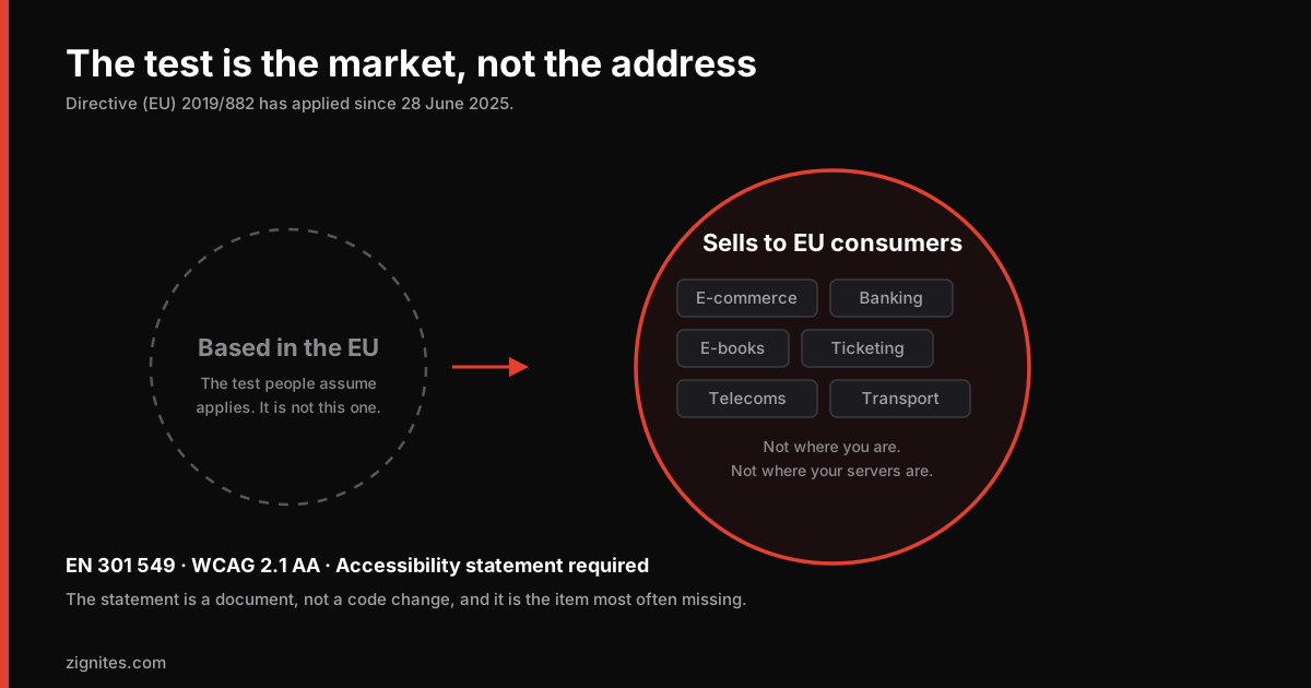
Directive (EU) 2019/882, the European Accessibility Act, has applied since 28 June 2025. Member states have been implementing enforcement through their own national law, and market surveillance activity has been ramping through 2026. This is no longer a future deadline.
This is a practical overview, not legal advice. The directive is implemented separately in each member state and the specifics of who enforces it, how, and with what consequences vary by country. If you have real exposure, the national implementing law of the markets you sell into is the text that matters, and a lawyer in that jurisdiction is who should read it.
Why this reaches further than people assume
The EAA is written around products and services placed on the EU market. That is a market-based test rather than a location-based one.
The practical implication: being based outside the EU does not put you outside the scope. If you sell to consumers in the EU, the regime is aimed at your service regardless of where you or your servers are.
For a Pakistani, British, American or Australian company with EU customers, this is the part that gets missed. Teams read "European" and stop.
The categories that carry the clearest obligations include e-commerce, consumer banking and payment services, e-books, ticketing and transport services, telecommunications, and audiovisual media access services. If your product is a consumer-facing service in one of those areas with EU users, treat yourself as in scope until someone qualified tells you otherwise. That includes the mobile app, not just the website, which is worth remembering when you are choosing a mobile stack and deciding how much custom UI to build.
There is a microenterprise provision for very small businesses providing services, and there are proportionality provisions where compliance would impose a disproportionate burden. Both are narrower than people hope, and both require documentation to rely on. "We are small" is not a defence you can assert casually; it is a position you have to evidence.
What the standard actually requires
The technical standard referenced across the EU is EN 301 549. For web content, the operative core is WCAG 2.1 Level AA. Later versions of the standard are expected to move to WCAG 2.2.
That is the useful takeaway: for the web portion, this is WCAG AA. It is not a novel standard invented for this directive, it is the same accessibility guidelines the industry has had for years, now with a legal instrument behind them.
There are two things beyond the code, and they catch people out more often than the code does.
An accessibility statement is required. A published statement describing how your service meets the requirements, where it does not, and how someone can report a problem. This is a document, not a code change, and it is the item most commonly missing. It is also the easiest thing for a market surveillance authority to check, because they can look at your site without testing anything. Sweden's telecoms regulator, for example, has been running surveillance of e-commerce sites with a focus on exactly this.
Documentation of your conformance assessment. You are expected to be able to show your working: what you tested, when, what you found, what you did.
If you fix everything and publish nothing, you can still fail an inspection.
The failures that show up in almost every audit
We have looked at a lot of sites. The same problems recur, and the majority of them are cheap to fix.
Issue | Why it fails | Typical fix time |
|---|---|---|
Insufficient colour contrast | WCAG AA needs 4.5:1 for normal text, 3:1 for large text and UI components | Hours, once the tokens are corrected |
Form inputs with no programmatic label | A placeholder is not a label; screen readers announce nothing | Hours |
Keyboard traps in modals and menus | Focus enters and cannot leave without a mouse | Days |
No visible focus indicator | Removed by a CSS reset, usually years ago, usually deliberately | Hours |
Images with empty or decorative alt on meaningful content | Content is simply absent for screen reader users | Days, mostly content work |
Video without captions | A direct AA failure with no workaround | Depends on volume |
Custom components with no ARIA roles | A div with a click handler is not a button to assistive tech | Days to weeks |
Errors signalled by colour alone | Invisible to colour-blind users, a large population | Hours |
Missing or wrong page language attribute | Screen readers use the wrong pronunciation rules | Minutes |
No accessibility statement | A direct EAA obligation, independent of the code | Hours |
The pattern is worth noticing. Most items on that list are hours, not weeks. The expensive ones are custom interactive components and video captioning, and both are predictable enough to plan for.
A note on contrast, from our own experience
Contrast is the most common failure and the one most often assumed to be fine.
Our own brand red is #E4402F. It looks like it should pass. It does not, in two specific combinations: white text on it comes out at 4.14:1, and using it as normal-size text on our dark card background gives 4.41:1. Both are under the 4.5:1 threshold.
We shipped that combination before catching it, and the fix was a corrected token set: a slightly darker variant for buttons with white text, and a slightly lighter one for accent text on cards. The brand looks unchanged. The numbers pass.
The lesson is that contrast has to be computed, not judged by eye. A colour that looks strong against a dark background frequently is not, and designers and developers are both bad at estimating it. Every accessibility regression we have had on this site traced back to somebody trusting their eyes.
Automated testing finds a minority of the problems
This is the part that undermines most compliance plans.
Automated tooling (axe, Lighthouse, WAVE, Pa11y) is genuinely useful and you should run it in CI. It reliably catches contrast, missing alt attributes, missing labels, missing language attributes, and broken heading structure.
It cannot tell you whether your alt text is meaningful, whether your focus order makes sense, whether your error messages are useful, whether a custom widget behaves correctly with a screen reader, or whether the page is comprehensible when navigated by keyboard alone.
A perfect Lighthouse accessibility score means the machine-checkable subset passed. Our own blog scores 100 on that check, and we still do the manual pass, because the score and the outcome are different things.
The realistic programme is three layers:
Automated checks in CI, blocking merges on regressions. Cheap and permanent.
A manual keyboard pass on every significant flow. Unplug the mouse. Complete signup, checkout, search, contact. Anything you cannot finish is a defect.
Screen reader testing on your primary flows. NVDA on Windows or VoiceOver on macOS and iOS. An hour of this finds things a full day of automated tooling will not.
If budget allows, testing with actual assistive technology users outranks all three. Nothing else surfaces the same class of problem.
A sequence that works
If you are starting from nothing and need to make real progress, in order:
1. Establish where you stand. Run automated tooling across your top twenty pages by traffic and your complete conversion flow. Record the results with a date. This is the start of your conformance documentation.
2. Fix the token-level issues first. Contrast, focus indicators, form labels, language attributes. These are usually a handful of changes in a design system that fix hundreds of individual failures at once. Best ratio of effort to result in the entire project.
3. Do the keyboard pass on your money flow. Whatever produces revenue: checkout, signup, booking, enquiry. If a keyboard user cannot complete it, that is both a legal exposure and lost revenue, and the second framing is the one that gets it prioritised.
4. Publish the accessibility statement. Even while work is ongoing. It should describe the current state honestly, including known gaps and your plan. A statement acknowledging specific unresolved issues is far better than no statement, and it is what an inspection expects to find.
5. Put it in CI. Otherwise you will fix everything once and regress within two release cycles. This is not a project you complete, it is a standard you hold.
6. Book the manual review. Screen reader testing on primary flows, repeated when those flows change materially.
The argument that is not about compliance
Roughly one in four adults in the EU has some form of disability. That is the market you exclude when checkout cannot be completed by keyboard.
And the overlap with ordinary quality is larger than most teams realise. Proper form labels improve autofill. Sensible heading structure improves both navigation and machine readability, which is the same structural work that makes content extractable by AI answer engines, as we covered in getting cited by AI search. Good contrast is what makes a screen legible in sunlight, which is where a lot of mobile browsing actually happens, a point we made in mobile-first design and Core Web Vitals.
Accessible sites are better sites for everyone. The legal instrument is a deadline attached to work that was worth doing regardless.
Where to start if you are behind
The honest read: if you have never run an accessibility audit and you sell into the EU, you are probably not compliant, and you are also probably closer than you fear. Most sites fail on a small number of systemic issues repeated across every page rather than hundreds of distinct problems.
A design token fix and a form label pass frequently resolve the majority of automated findings in a week.
If you want an outside read on where you stand, send us the URL. We will run the automated pass and a keyboard walkthrough of your primary flow and tell you what the real gap is. Often it is smaller than expected, and knowing that is worth more than another month of not looking. More on how we build this in from the start on our web development services page.
This post is general information, not legal advice. The EAA is implemented through national law in each member state and obligations vary. Take advice from a lawyer in the markets you sell into.
Common questions
Does the European Accessibility Act apply to companies outside the EU?
Yes, in effect. The EAA is built around products and services placed on the EU market, which is a market-based test rather than a location-based one. A company based outside the EU that sells covered services to EU consumers is generally within scope regardless of where it or its infrastructure is located. This is the point most often missed by teams who read "European" and assume it does not concern them.
What standard does the EAA require for websites?
EN 301 549 is the European standard referenced for digital accessibility, and for web content its operative core is WCAG 2.1 Level AA. Later versions of the standard are expected to align with WCAG 2.2. For most web teams this means the accessibility guidelines the industry has used for years, now with a legal instrument behind them.
What is an accessibility statement and is it mandatory?
It is a published document describing how your service meets accessibility requirements, where it falls short, and how someone can report a problem. It is a direct obligation under the EAA and it is the single most commonly missing item, partly because it is a document rather than a code change. It is also the easiest thing for a market surveillance authority to check without testing anything, which is why regulators have focused on it.
Is passing an automated accessibility test enough?
No. Automated tools reliably catch contrast failures, missing alt attributes, missing form labels, missing language attributes and broken heading structure. They cannot assess whether alt text is meaningful, whether focus order makes sense, whether a custom widget works with a screen reader, or whether a flow can be completed by keyboard. A perfect Lighthouse score means the machine-checkable subset passed, which is a minority of the requirements.
What should we fix first?
Design token issues: colour contrast, visible focus indicators, form labels and page language attributes. These are usually a small number of changes in a design system that resolve hundreds of individual page-level failures at once, which makes them the best ratio of effort to result. Then do a keyboard-only pass on whatever flow produces your revenue, and publish an accessibility statement describing your current state honestly, including gaps.